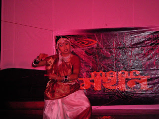
 Hi friends... so it was 22nd of sep, when maac preet vihar organised "MAAC MANTHAN'' to produce anmol ratan of the institute... not only in the sphere of academics but also in co-curricular activities which is also a part of our study. Vfx, documentary, short films, 3d animation....other than that dancers, actors n singers..... watever talent u want is here in maac preet vihar........
It was started with our faculty Mr. Rahul pandey aka Raj n Mr. Vijay, the hosts for the day n entertained alll with their great mimicry n acting skills......
The guest for the day were Mr. Naveen gupta (COO), MAAC INDIA
Manthan started with ganesh vandana, follwed by dance on a western v/s classical mix and then a bollywood ishtyle dance [ it was just roking man]....... also the screening part was continued in between these rocking n mind blowing performances by our students. Two of our friends jus rocked the day with a rap n music too generated manualy by mouth... then came all the aksay kumar's of maac with mast kalander on the stage......
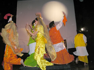
Then lions n sherniya of punjab came with only one say- chak de fatte... just heart winning bhangra n gidda....
Mr. Paresh Parekh, the name which is always responsible for the enthusiasm n the best part of party with all of his actors from maac preet vihar on stage to act a play.... so funy n kool, u all know man........
Some great animation n compositing was also shown by Voodoo.... Team members of Voodoo (Amit, Ashok, Natasha, Nida, Nupur, Atif, Satender, Anshika) have done a great job.... They did a really gud work.... Hats off to all of them !!!!
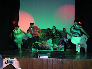 To end the function was again on stage our students with a maharashtrian song..... hmm our Mr. rahul also showed his some dance movements.....lolzzzz. Next was the galssssssss...... all babies of maac preet vihar with Heyy Babby
Now was the time for the best students to be awarded for their commitment and hardwork....so the 2nd runner ups were Crushers, the first runner ups were Anime pazzi and the first prize was shared by the Steps and Gravity
And the last was all our faculties n our sweet coordinators to jhoom on jhoom barabar jhoom........
All was awesum and rockin.....bt it was the least not the last..... its maac preet vihar yaar..abi baki hai.... nw it was time to get on terrace with the guest for night........shankar sahni..... and all dance the night on his voice and rocked the party…….
You have Pixel Size and DPI and want image size:
Image Width = 3000 pixels / 300DPI
Image Width = 10 Inches
Image Height = Pixel Height / DPI
Image Height = 2400 pixel / 300 DPI
Image Height = 8 Inches
You have Pixel Size and Inches and want DPI
This one is not all that useful and I can't think of any reason to use it practially but here is it anyway.
Horizontal DPI = Pixel Size (Width) / Inches (Width)
Horz. DPI = 3000 pixels /10 inches
Horz. DPI = 300DPI
You can use the same equation for the Vertical DPI as well. Some printer are the same resolution in both axes.
This one is usful when you know that your printer can print 300dpi and you would like to print an image that is 8 x 10 and need to nkow how big to render your final image to do this. Of couse you could always render it bigger, but rendering time is precious so you never want to render more pixels that you have to.
Pixel Width = DPI x inches (Width)
Pixel Width = 300 DPI x 10 inches
Pixel Width = 3000 pixel wide
Again the same formula can be used for pixel Height as well.
Sources : Internet & Forum
Basically when you are printing/rendering an image you have three variables to consider:
- DPI/PPI (Dots per Inch/Pixels per Inch) Both are known as resolution.
- Pixel size - measured in pixels (this is normally what you render to and is how monitors are measured.
- Print size - measured in inches (can be anythign but I'll use inches for convinience)
First you need to know what resolution your printer can handle. Some will say that they go to 1200 dpi or 600 dpi, but in practice you should never need to go bigger than 300 dpi, even if you are printing a 60 ft wide billboard. Just like digital camera's non-optical zoom abilities, printers use DPI to claim superiority in the industry.
DPI is the number of dots of ink that are put down by your printer onto a page over a one inch line. The amount of resolution that a printer can achive is based upon how close together the print head elements or jets are positioned. Of course it is a bit different with a 4 color press, but for now I'll just leave it at that. You may also notice that your inkjet will say that the vertical resolution will is different than the horizontal resolution. This is becuase in one axis the printer is relying on the proximity of the jets to each other, whereas the oher diection is related to the sensativity of the rollers that are feeding the paper across the jets.
b) Pixel Size
I'm assuming that everyone is pretty familiar with pixel size as we deal with is on a daily basis. However, don't assume that your print house will be, because in many case they are not. You will usually need to give them an image size in inches based upon the resolution that their printer is capable. Don't try to explain it to them becuase they just won't get it.
Pixels are something that your monitor uses to describe the very small square dots (pixels) of light that are lit up by the guns of your CRT. (LCDs are different) Typically we say that a monitor is 72dpi.
A pixel translated to a page is usually represented by many dots of ink depending upon the print resolution.
c) Print Size
This one is pretty self explantory and is the image size on the page that your printer printed.
Sources : Internet & Forum
 ZBrush 3.1 gives you access to unparalleled power and control previously unknown in digital art creation software. Controls enable sculptors to create with a stylus and a tablet as intuitively as if they were using their hands on a block of clay. ZBrush further extends the creation experience, harnessing technology and providing artists with a multitude of creation-enhancing tools.
New Features
- Transpose
Posing your model is as simple as moving an action line. Create a mask to isolate an area, click and drag. It’s no more complicated than posing a clay model with your fingers - MATCAP
Matcap lets you apply real world texturing and lighting to your model. Sample a few points from your chosen photograph or texture; apply to your model, and seconds later you’ve got a model complete with texture and lighting - Perspective Camera
The perspective camera gives you the ability to apply perspective to your model, giving you the ability to adjust your focal length at will - Speed
Multithreaded support for up to 256 processors let ZBrush compute at the speed of your imagination - Higher Poly Count
Up to a billion polygons allow you to create objects with almost infinite detail. - HD Geometry
HD Geometry allows you to divide your model to 1 billion polygons, and your system will only process the polygons visible onscreen. - Topology
ZSpheres makes simple and fast work of creating a new topology. And the projection feature lets you shrink-wrap your topology to an existing model. - Scripted Interface
ZBrush’s integrated scripting lets you create an interface that suits your workflow and your needs. Move existing interface items as you like, or add entirely new buttons and palettes to your interface. - User Defined Alpha and texture Start up
Customize your environment with the alphas, textures, materials and plug-ins you use most. - New Movie Palette
Create, view or export ZBrush tutorials, movies, turntables, models, and even time-lapse videos of your sculpting process. - 64 bit support
ZBrush takes full advantage of your 64-bit system.
- Accelerated Performance
The integration of new technology into the software’s Adaptive Degradation System improves
interactive performance by automatically simplifying scene display to meet a user-defined target frame rate. You control how 3ds Max adjusts scene display—for example, whether the smallest objects are hidden or distant objects have less detail—and 3ds Max calculates how best to achieve it. When combined with the new Direct3D® mesh caching that groups objects by materials, the result is that tens of thousands of objects can be just as interactive as ten objects. In addition, loading, arrays, FBX® and OBJ export, and other areas of the software
perform significantly faster. - Scene Explorer Scene Management
3ds Max 2008 delivers Scene Explorer, a robust new tool that provides a hierarchical view of scene data and fast scene analysis, as well as editing tools that facilitate working with even the most complex, object-heavy scenes. Scene Explorer gives you the ability to sort, filter, and search a scene by any object type or property (including metadata)—with stackable filtering, sorting, and searching criteria. This new tool also enables you to save and store multiple Explorer instances and to link, unlink, rename, hide, freeze, and delete objects, regardless of what objects are currently selected in the scene. You can also configure columns to display and edit any object property, and because this feature is scriptable and SDK extendable, you can use callbacks to add custom column definitions. - Review Rendering
This powerful new toolset gives you immediate feedback on various render settings, enabling you to iterate rapidly. This means you can now quickly hone in on your desired look without waiting for a software render—perfect for over-the-shoulder client/boss feedback sessions, and other iterative workflows. Based on the latest game engine technology, Review delivers interactive viewport previews of shadows (including self-shadowing and up to 64 lights simultaneously), the 3ds Max sun/sky system, and mental ray Architectural and Design material settings. - MAXScript ProEditor
3ds Max 2008 marks the debut of the new MAXScript ProEditor. This intuitive new interface for working with MAXScript includes multilevel undo functionality; fast, high-quality code colorization; rapid opening of large documents; line number display; regular expressions in search/replace; folding of sections of the script; support for user-customization; and many
other features. - Enhanced DWG Import
3ds Max 2008 delivers faster, more accurate importing of DWG files. Significantly improved memory management enables you to import large, complex scenes with multiple objects in considerably less time. Improved support for material assignment and naming, solid object import, and normals management facilitate working with software products based on the Revit 2008 platform. Plus, a new Select Similar feature identifies all objects in an imported DWG scene that contain characteristics similar to those of a selected object. This capability lets you select and edit multiple imported objects simultaneously— dramatically streamlining DWG-based workflows. - Artist-Friendly Modeling Options
3ds Max 2008 gives you a more streamlined, artistfriendly modeling workflow through a collection of hands-on modeling options that let you focus on the creative process. These options include selection previewing and the ability to have existing modeling hotkeys and pivots become temporary overrides. - Biped Enhancements
This latest release provides new levels of flexibility with regard to your Biped rigs. A new Xtras tool lets you create and animate extraneous Biped features anywhere on your rig (for example, wings or additional facial bones) and save them as BIP files. These files are supported in Mixer and Motion Flow, as well as in layers where new layering functionality enables you to save BIP files as offsets from each layer to isolate character motion. As a result, you can save each layer as its own asset for export into a game. - Expanded Platform Support
3ds Max 2008 is the first full release of the software officially compatible with Microsoft® Windows Vista™ 32-bit and 64-bit operating systems, and the DirectX 10 platform.
Sources : www.autodesk.com/3dsmax
 Scott Farrar
(Visual Effects Supervisor)
Joining ILM as a visual effects cameraman, Farrar's early work includes Star Wars: Episode VI - Return of the Jedi, Willow, and Who Framed Roger Rabbit. His camera work on the film Cocoon helped ILM win an Academy Award for Best Visual Effects in 1986. After becoming an ILM Visual Effects Supervisor in 1988, Farrar helped the company earn three more Academy Award nominations for their visual effects work in the films Backdraft, A.I. Artificial Intelligence, and The Chronicles of Narnia: The Lion, the Witch and the Wardrobe. His other credits as an ILM Visual Effects Supervisor include Cocoon: The Return, Back to the Future Part II, Back to the Future Part III, Wolf, Amistad, Deep Impact, The Mummy, Star Wars: Episode I - The Phantom Menace, Minority Report, and, most recently, 2007's Transformers (written by Roberto Orci & Alex Kurtzman). He was also an additional effects plate photographer on Jurassic Park and supervised the visual effects of the end sequence in Men in Black.
FILMOGRAPHY
- Foes (1977)
Special Effects - Star Trek III: The Search for Spock (1984)
Camera Operator - Back to the Future Part III (1990)
Special Effects - Star Trek VI: The Undiscovered Country (1991)
Special Effects - Alive (1993)
Special Effects - Congo (1995)
Supervisor/Manager - Daylight (1996)
Special Effects Supervisor - Amistad (1997)
Special Effects Supervisor - Deep Impact (1998)
Special Effects Supervisor - Cowboys (2000)
Visual Effects Supervisor - Artificial Intelligence (2001)
Visual Effects Supervisor - Minority Report (2002)
Visual Effects Supervisor - Peter Pan (2003)
Visual Effects Supervisor - Rent (2005)
Visual Effects Supervisor - The Chronicles of Narnia: The Lion, the Witch, and the Wardrobe (2005)
Visual Effects Supervisor - Transformers (2007)
Visual Effects Supervisor
Here's a quick look at some of the features that I think will be creating a lot of buzz:
1. The new user interface
Anytime Adobe (or anybody for that matter) messes with the interface for a product, it sends chills down the spine of many users. However, in CS3 the changes can be as minor or major as you want because this is probably the most customizable interface for Photoshop yet.
The first thing you'll probably notice is the single-column toolbar. It freaked me out a little the first time I saw it, but once I learned that you can return to the familiar two-column toolbar with just one click (right above the toolbar on the far left), then I felt right at home. Once my fears were gone, I started using the single-column toolbar and now I feel right at home with it. Best of all, it takes up less space on screen (which means more room for my images).
The other big interface change is the palette scheme, which (once again) is designed to put your images center stage by better managing your palettes (and the loads of space they used to occupy). Again, you can go back to the old method of floating palettes everywhere, but if you take a few days to get used to these new get out of the way fast palettes, I doubt you?ll want to go back. My favorite change in this area is the new Maximize Screen Mode view, which adjusts your window size automatically as you add and collapse palettes.

2. Huge improvements to Camera Raw
Camera Raw has really matured. The new version built into CS3 brings a wealth of new features, and (get this) the ability to use the Camera Raw dialog to edit both JPEG and TIFF images, as well as raw images. This changes everything!!!!
Among the main improvements is a Fill Light slider (kind of like the Shadow slider from Photoshops Shadow/Highlight command, but without the milky side effect that comes from using that control with its default settings). Theres also a brilliant slider named Recovery, which lets you pull back some of the highlights (to avoid clipping the highlights) without having to lower the Exposure, which affects more than just those blown-out highlights. This just rocks. Also new is the Vibrance slider, which does a much better job of increasing the saturation of any under-saturated areas in your photo without overly-affecting colors that are already well-saturated. This will probably put the regular Saturation slider out of business because it's just that much better. Besides these improvements, there are also a lot of handy interface tweaks, including color-coded bars to help you know which way to move the sliders to achieve the color or brightness you're looking for.
They've also added a wonderfully designed, intuitive Parametric Curve adjustment that makes it easy to adjust your image, and will even help users who don't understand Photoshop's regular Curves function get a better grasp of how to unlock its power. This definitely shares 'Star of the show status with the Recovery slider and Fill Light sliders.
Split Toning, the popular feature from Adobe Lightroom, has made its way over to Camera Raw in CS3. Honestly, I like the easy implementation of it here better than in Lightroom. Couple that with the new ability to save custom presets of your favorite Camera Raw settings and you've got one kick-butt new version of Camera Raw that makes previous versions obsolete!

3. The Quick Select tool
OK, this tool is probably the best selection tool since Extract because it's incredibly easy to use, and best of all, it really works. However, as cool as this tool is, in my opinion, the bigger feature is the Refine Edges floating palette, which gives you unprecedented control over selections; not just with this tool, but with ALL of Photoshop CS3's selection tools. You will be amazed at how much easier selections (especially tricky selections) have gotten with these two new must-have tools.

4. Mo Better Curves
Adobe has stayed away from the Curves dialog for a year, and with good reason it's just about perfect. The key words there are just about because they've added some options and made the tool more flexible without changing (i.e. messing up) the basic operation of this pro's color tool of choice. They've done this through an Options area that lets you choose which options you want to display, including the long-awaited Clipping Warnings and in-dialog Histogram. So, you've got a better Curves dialog with more visual feedback, without messing anything up. Well done, Adobe!

5. Printing Done Right
Adobe made a number of modifications to the Print dialog, and they?re all in the right direction, including a usable preview and easier configuration, without digging through a bunch of different dialogs like you had to back in CS2.

6. Black-and-White Conversion Control
Not only did Adobe add a better tool for converting from color to black & white, not only did they give you built-in presets, not only did they give you built-in tinting and the ability to leave the dialog box and click-and-drag within an area of your photo that corresponds with the color sliders in the Black-and-White control, bless Adobe's little pixel-lovin heart; they made it an Adjustment Layer. Life just got better.

7. Auto Align and Auto Blend
Think of the magic that Photomerge uses to put a panorama together: aligning elements within your sections of photos, then blending the colors seamlessly. Now imagine you're not stitching together a pano, but you have those same controls (and then some). That's Auto Align (which automatically aligns to related photos), and Auto Blend (which blends color seamlessly). These are some of those tools that look like real magic. Pretty darn brilliant.
8. New and Improved Bridge
I would have thought that Adobe Camera Raw would win my award for most-improved player, but once I saw the new Bridge, I knew we had a winner. This is a HUGE step forward for the Bridge, adding features such as a built-in Loupe tool for magnifying specific areas without zooming in on the entire image. It?'s very well implemented. Also, the ability to compare photos side-by-side is just huge. There are tweaks and improvements all over, including easier access to information, much faster drawing thumbnails thanks to new smart-thinking view options, and improved Slideshow capabilities. I'm just scratching the surface, but I can safely say that if this CS3 version had been Bridge 1.0, it sure would have made a lot of converts.

9. Smart Filter
Think Smart Objects, but perhaps a little bit smarter. Finally, here's a non-destructive way to apply multiple filters to an image and still go back and change your mind later (much later if you like). Implementing these Smart Filters like Layer Styles was a stroke of interface design genius. It just makes so much sense. Throw in the mask that comes with every Smart Filter and you?ve got a big winner on your hands. A big pat on the back to the engineer(s) who came up with this puppy!

10. Improved Cloning and Healing
The new Clone Source palette makes the process much more visible (you can finally see a live preview of your clone source before you actually start cloning). You've now got more control over your cloning and healing than every before. Try it once, you'll be hooked.

- Normal
The default mode, this option displays every pixel in the active layer normally, regardless of the colors in the underlying layers. When you use opacity values (whether Opacity or Fill) of less than 100 percent, the color of each pixel in the active layer is averaged with the composite pixel in the layers behind it. Normal mode is called Threshold when you're working with a bitmapped or indexed-color image. - Dissolve
This option specifically affects feathered or softened edges. If the active layer is entirely opaque with hard edges, Dissolve has no effect. But when the edges of the layer is fade the result color is a random replacement of the pixels with the base color or the blend color, depending on the opacity at any pixel location. However, when you drop the Opacity value below 100 percent, Dissolve will dithers all pixels.Note: Dissolve does not dither pixels in the drop shadow layer effects. Layer effects are governed by their own independent blend modes. - Darken
Darken applies colors in the active layer only if they are darker than the corresponding pixels below for each channel and pixel-by-pixel. Pixels in underlying layer that lighter than the blend color are replaced, and pixels darker than the blend color do not change. For example in one corresponding pixels, in blue channel in the active layer darker than the blue pixel of underlying composite pixel and the red and green components lighter. In this case, Photoshop assigns the blue component but not the red or green. - Multiply
Looks at the color information in each channel and multiplies the base color by the blend color. The result color is always a darker color. Multiplying any color with black produces black. Multiplying any color with white leaves the color unchanged. When you're painting with a color other than black or white, successive strokes with a painting tool produce progressively darker colors. The effect is similar to drawing on the image with multiple magic markers. - Linear Burn
Looks at the color information in each channel and darkens the base color to reflect the blend color by decreasing the brightness. Blending with white produces no change. Linear Burn creates a smoother, less vibrant effect than Color Burn. - Lighten
Opposite with Darken mode, Lighten applies colors in the active layer only if they are lighter than the corresponding pixels in the underlying image. As with Darken, Photoshop compares the brightness levels of all channels in a full-color image. Pixels of underlying layer that darker than active layer are replaced, and pixels lighter than the blend color do not change. - Screen
Screen is the opposite of Multiply. Rather than creating a darker image, you create a lighter image. Photoshop looks at each channel's color information and multiplies the inverse of the blend and base colors. The result color is always a lighter color. Screening with black leaves the color unchanged. Screening with white produces white.Screen is useful for creating glows, retaining just the light colors in a gradient, and creating light noise effects such as snow and stars. - Color Dodge
Looks at the color information in each channel and brightens the base color to reflect the blend color by decreasing the contrast. Blending with black produces no change. When you apply the Color Dodge modes, each color in the layer becomes a brightness-value multiplier. Light colors such as white produce the greatest effect, and black drops away. - Linear Dodge
Create similar effect with Color Dodge. Looks at the color information in each channel and brightens the base color to reflect the blend color by increasing the brightness. Blending with black produces no change. Linear Dodge creates similar but smoother effect than Color Dodge. - Overlay
Multiplies or screens the colors, depending on the base color (underlying layer). Patterns or colors overlay the existing pixels while preserving the highlights and shadows of the base color. The base color is not replaced but is mixed with the blend color to reflect the lightness or darkness of the original color. - Soft Light
Darkens or lightens the colors, depending on the blend color. The effect is similar to shining a diffused spotlight on the image.If the blend color (light source) is lighter than 50% gray, the image is lightened as if it were dodged. If the blend color is darker than 50% gray, the image is darkened as if it were burned in. Painting with pure black or white produces a distinctly darker or lighter area but does not result in pure black or white. - Hard Light
Multiplies or screens the colors, depending on the blend color. The effect is similar to shining a harsh spotlight on the image.If the blend color (light source) is lighter than 50% gray, the image is lightened, as if it were screened. This is useful for adding highlights to an image. If the blend color is darker than 50% gray, the image is darkened, as if it were multiplied. This is useful for adding shadows to an image. Painting with pure black or white results in pure black or white. - Vivid Light
Burns or dodges the colors by increasing or decreasing the contrast, depending on the blend color. If the blend color (light source) is lighter than 50% gray, the image is lightened by decreasing the contrast. If the blend color is darker than 50% gray, the image is darkened by increasing the contrast. - Linear Light
Burns or dodges the colors by decreasing or increasing the brightness, depending on the blend color. If the blend color (light source) is lighter than 50% gray, the image is lightened by increasing the brightness. If the blend color is darker than 50% gray, the image is darkened by decreasing the brightness. - Pin Light
Replaces the colors, depending on the blend color. If the blend color (light source) is lighter than 50% gray, pixels darker than the blend color are replaced, and pixels lighter than the blend color do not change. If the blend color is darker than 50% gray, pixels lighter than the blend color are replaced, and pixels darker than the blend color do not change. This is useful for adding special effects to an image. - Hard Mix
The Hard Mix blend mode combines the pixels in your layers using the Vivid Light blend mode and then performs a color threshold operation on them. Hard Mix mixes two layers and pushes the colors to their absolute extreme. All in all, Hard Mixed pixels come in only eight colors: black, white, red, green, blue, cyan, magenta, and yellow, the end result being quite similar to the Posterize command (Image » Adjustments » Posterize). - Difference
Difference inverts lower layers according to the brightness values in the active layer. White inverts the composite pixels absolutely, black inverts them not at all, and the other brightness values invert them to some degree in between. Blending with white inverts the base color values; blending with black produces no change. - Exclusion
Creates an effect similar to Difference Mode but lower in contrast often smoother effect. Blending with white inverts the base color values. Blending with black produces no change. Exclusion sends mid-tone to gray, much as Pin Light sends mid-tone to transparent. - Hue
Creates a result color with the luminance and saturation of the underlying layer color with the hue of the blend color in active layer or painted color. - Color
Creates a result color with the luminance of the base color and the hue and saturation of the blend color. This preserves the gray levels in the image and is useful for coloring monochrome images and for tinting color images. - Luminosity
Creates a result color with the hue and saturation of the base color and the luminance of the blend color. This mode creates an inverse effect from that of the Color mode.




 ShareThis